Designing a brand-new office
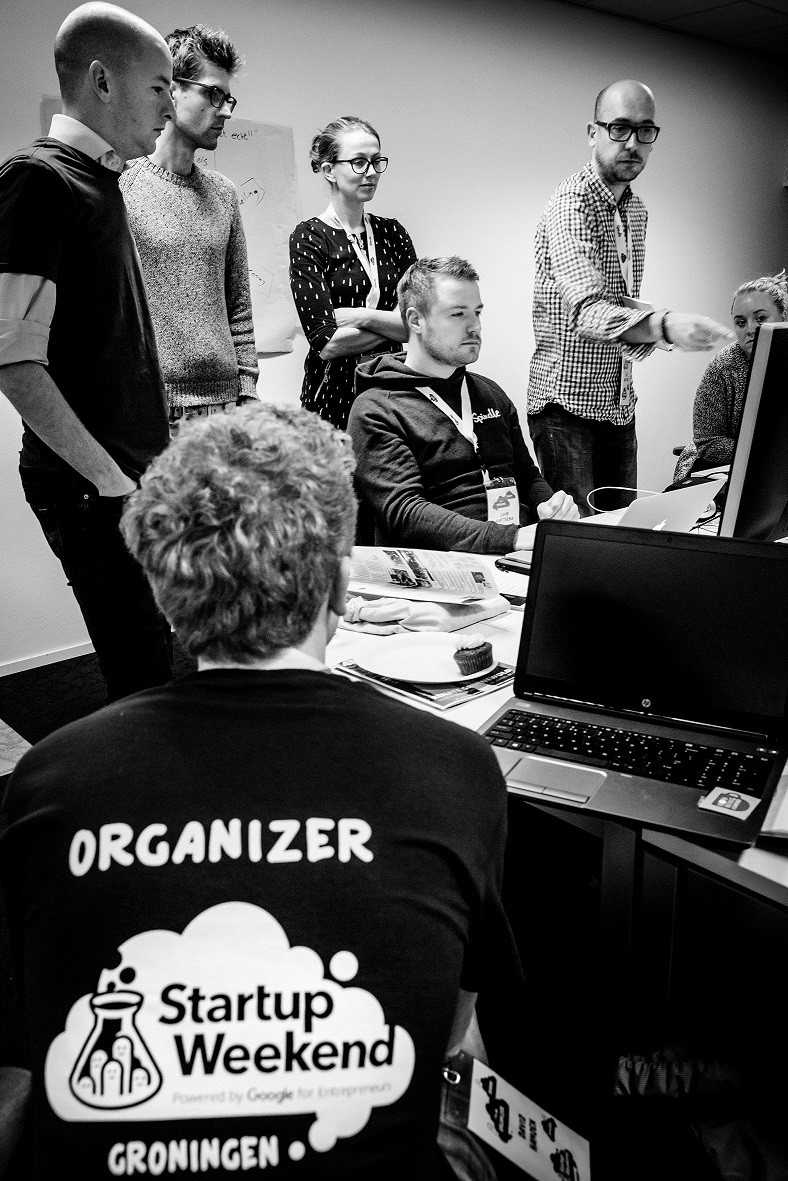
Organising an event like Startup Weekend in your city is a bit like owning Sauron’s ring. It is difficult to let go because it is such a powerful tool to make such a great and gratifying impact with. A bit more than a month ago we proved this again by hosting the 12th edition of Startup Weekend Groningen. 84 participants worked throughout an intense weekend to build 14 new startups, learning valuable lessons, gaining confidence, and making meaningful friendships along the way.
In the last 3 years I have been lead organizer of Startup Weekend Groningen. I managed to both organise- and build a holacracy driven self-governing organizational culture of which I hope the startup ecosystem of Groningen will benefit, for a really long time.
Please think of this; If I would ask you; Do you want to be a superhero? What would your answer be? It is great when others appreciate, love and admire you for what you do, right? It gives a sense of purpose and meaning.
Despite there is nothing wrong with that, I would love to argue that it’s not sustainable for your ecosystem / company / community if you were to become the super hero. By now surely a hero has crossed your mind. Who were you thinking of? Wonder Woman or Superman perhaps? The hero you were thinking of is probably a strong individual with unique skills and qualities doing remarkable things such as saving the world all by themselves.
Now here is the issue. I have met many strong individuals who can be admired for who they are, what they do, or the position they hold. You are likely one of them. Some individuals are more exceptional than others. But it’s worthless if performance is all depending on that single person. One day that person is going to hand over their work and they have to make sure others can take over and meet their standard without having to sacrifice a healthy work-life balance.
Although the world sometimes seems to incentivize hard work or outperforming others to grow to a leadership position. I learned that hard work is not how great leadership can be distinguished. I argue that those heroic leaders who make others feel subordinate or stupid in comparison, even while it happens so unintendedly (which is mostly the case for a variety of reasons) are actually more like pretentious villains than they are superheroes. They are leaders who intrinsically have the right motivations but often trust themselves more than they do trust the people they work with.
Even despite they might be right at times, and actually deliver more trustworthy outcomes, as long as trust is not given to peers, leaders will remain indispensable. Being indispensable might seem appealing to some, but it is not. Superheroes should become superfluous so they can take on new endeavours.
Although the world sometimes seems to incentivize hard work or outperforming others to grow to a leadership position, hard work is not how great leadership can be distinguished.
As lead organizer I’ve worked together with the team to create a safe environment in which leadership is distributed to various roles. It doesn’t make sense to try and control everything by yourself, or to think that you know what is best. Someone designated to a specific task or job will always make better informed decisions. Authority should be distributed. Great leaders turn others into equal great leaders.
All a lead organizer does is safeguarding that environment so the team can explore, make mistakes, create great things, be upfront, feel motivated about the things they initiate by themselves, learn valuable lessons in the process, accomplish their ambitions, become more knowledgeable, do things someone else is considered better at, discover cohesiveness between various parts of the organisation, have authority within their roles and make decisions by themselves in favor of the organization. As a result everyone can lead, freeing up your time and headspace to grow into new things such as becoming more of a community lead instead of an event lead.
A coxed four is a rowing boat used in the sport of competitive rowing. The captain or so called coxswain is responsible for steering, calling the moves, responding to the way the other boats are moving and the safety of those in the boat.
Success depends on the physical and mental strength of the rowers, ability to respond to the environment, and the way in which the coxswain motivates the rowers, not only as individuals but as members of the crew. Everyone has its own explicit accountabilities. The accountabilities of coxswain are impossible to combine with the ones of the rowers and visa versa.
If you would extend these principles into a business situation you could argue that once the coxswain does start to do the rowing – which is what many leaders do when the pressure is high or the priorities are off – nobody is able anymore to successfully take accountability for an essential part of teamwork. Stay humble, don’t be a micromanager. Allow everyone to take ownership and keep each other as a team accountable for the responsibilities each one has.
Great leaders turn others into equal great leaders.
Reach out to me if you want to know more or if you have challenges your dealing with that you wish to discuss. I’m happy to schedule a call and discuss further how we did build a holacracy driven self-governing organizational culture. You can also check out our governance here.
Lorem ipsum dolor sit amet, consectetur adipiscing elit. Duis ultrices magna nunc, vitae eleifend dui cursus ultrices. Pellentesque habitant morbi tristique senectus et netus et malesuada fames ac turpis egestas. Curabitur rhoncus quam consequat, eleifend magna sed, sollicitudin leo. Orci varius natoque penatibus et magnis dis parturient montes, nascetur ridiculus mus. Donec non tortor nec velit vulputate ultrices nec vitae nunc. Duis quis efficitur enim. Curabitur pulvinar in nisl at euismod. Aliquam porttitor velit vel sodales ornare. Etiam blandit, sem ut tincidunt eleifend, ex eros mattis metus, nec faucibus dui justo vitae enim.
Pellentesque orci odio, aliquet et lectus id, viverra luctus nulla. Donec sed metus justo. Sed id augue at ex pulvinar mollis. Curabitur a nisi risus. Cras bibendum nunc vitae accumsan dapibus. Donec at lacinia massa. Nulla in pretium purus, quis ornare lacus. Nulla facilisi. Ut sollicitudin est maximus justo porta facilisis. Nulla facilisi. Nam tristique eros eu molestie dictum. Curabitur feugiat ultrices dictum. Nullam id mauris bibendum, vulputate mauris nec, laoreet massa. Interdum et malesuada fames ac ante ipsum primis in faucibus. Aenean venenatis vestibulum ligula ac pellentesque. Aliquam tempus, odio quis sagittis viverra, metus ante luctus mauris, vel tempor nibh eros sed eros.
Nunc tincidunt ante enim, ut scelerisque urna aliquet et. Ut interdum dolor libero, eu fringilla augue lobortis et. Quisque augue diam, fringilla a ligula ut, mattis consectetur turpis. Ut convallis nisl in ipsum placerat congue. Nunc euismod suscipit dolor vel pretium. Duis non commodo tellus, a convallis velit. Cras consectetur felis diam. Praesent nisi ante, porttitor et rutrum a, dapibus quis sapien. Orci varius natoque penatibus et magnis dis parturient montes, nascetur ridiculus mus. Donec eget libero lacus.
This is a repost from an article I wrote for Devhouse Spindle
https://wearespindle.com/articles/what-makes-the-next-web-hack-battle-awesome/
A couple of weeks ago, we went to The Next Web Hack Battle in Amsterdam. It has been the third year in a row that I participated in this event, and I love it. It is the best organised hackathon I know off. During The Next Web Hack Battle, you are being challenged to create a website or app within 36 hours while using one of the API’s of the API partners.
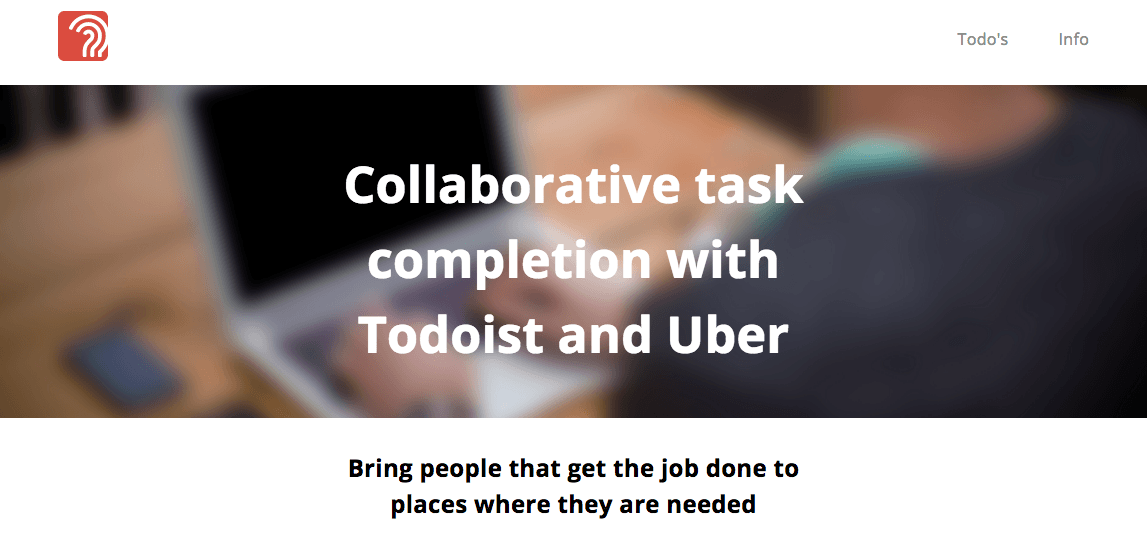
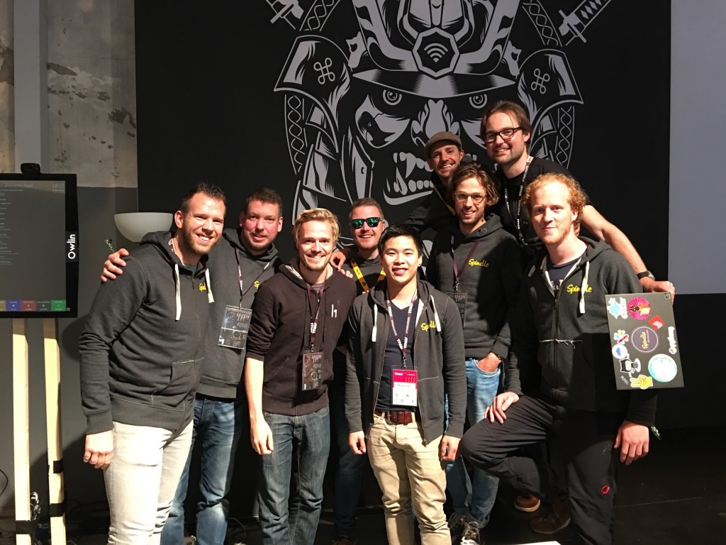
Our team of nine people decided to build something with the Todoist API. We built an app called “Please do this for me” that allows people to publicly list todo’s by simply adding a @public tag within Todoist. We also used the UBER API to get the people who can get the job done at the places where they are needed.
Our team won the prize for best integration with the Todoist API. We were rewarded with awesome prizes! Of course, we were all very excited. But there is much to win at this event even without actually winning. So no reason to be sad if you don’t win anything, these five things will make it a great experience no matter what:
You get to talk to awesome people who are just as excited as yourself about the things you love. Also, you can talk with people in the tech industry who are attending the conference. I encourage you to talk to as many people as you can. Compared to most conferences, The Next Web Conference is less populated by sales/marketing people. There are a lot of technical people who are actually building products and often face the same problems as you do.
Everyone is happy to share their knowledge and insights into their development processes and code stack. This often results in great new perspectives on specific issues.
You get to experiment with new techniques that may inspire you to do things different/better or solve faster in your own work.
Participating is a lot of fun (disclaimer: as long as everyone has had enough sleep and nobody gets grumpy, of course ;)). During this short period of time you get to know your team members/colleagues well. You can also attend the talks at The Next Web Conference. The stages are awesome and the people giving talks are too!
All these points together make you feel inspired. This, I believe, is the most important takeaway of going to conferences or hackathons.
So I hope to see you next year at TNW! Until then, you can read about this year’s presentations on The Next Web and here’s a funny movie made by the guys at Vooza.
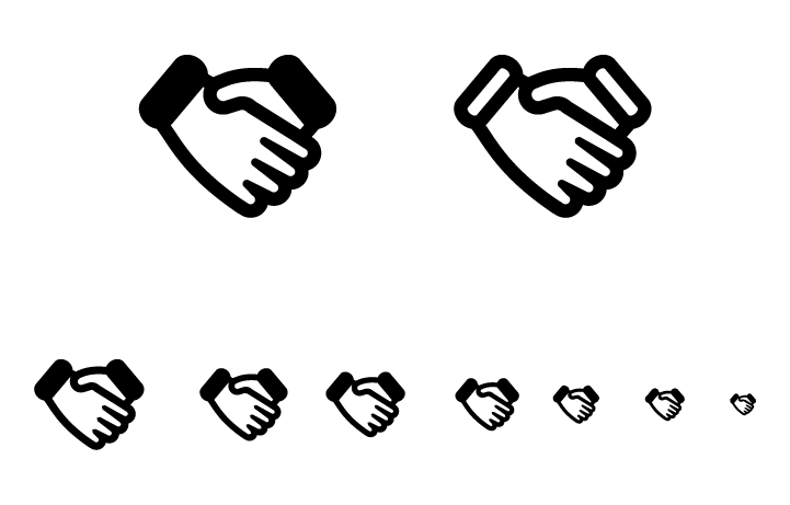
In Lily (an open source CRM package on steroids) we like to make use of icons from Font Awesome. For the representation of deals in Lily, we used the fa-money icon. The icon looks like a one dollar bill. Although I realise this might sound rather insignificant, it bothered me a lot because making a deal is not about receiving money.
It’s about entering a relationship that is beneficial to both parties. Besides that, the money icon gave me a “corky dorky core business” feeling, which is just lame. The money icon didn’t work very well aesthetically either. It’s very hard to recognise the face of George Washington or the value of the money on an icon that is merely 18 by 18 pixels.
Nevertheless, the font-awesome library we use contains over 600 great icons, so I was pretty sure it would contain a handshake icon that would emphasise cooperation, agreement and (business) relationships. Unfortunately, I had to discover there was no handshake icon. And apparently I wasn’t the only one looking for it. Since March 2013, a lot of people requested for a handshake icon on the Font Awesome GitHub repository.
When I searched the internet I found many handshake icons but they were quite unsatisfactory. The white space between the fingers is clogging up with most of them. I then tried a few designs of my own. My first designs also had the same issues with the fingers clogging up. I wanted the icon to be as square as possible so that the space was used optimally. I discovered during my first designs this was really difficult to achieve with two hands holding each other while maintaining some sort of symmetry.
With this blog post, I like to offer my final design to icon designer @DaveGandy and like to invite him to add the handshake icon I’ve designed to the Font Awesome icon set. I think it would make loads of people incredibly happy. For those who would like to use the icon already but can’t wait until Dave and I shake hands (I’m hoping he will reach out to me). The icon can be downloaded as a .SVG or an Adobe Illustrator file. As with everything else we do, the end result is open sourced under Creative Commons licence (CC BY-SA 4.0). That means you can copy, clone, alter, and do anything with it you like.
Half a year ago I started working at Devhouse Spindle. As a user interface designer, I take responsibility for the creation of user interfaces that allow users to perform their tasks quick, easy and intuitive.
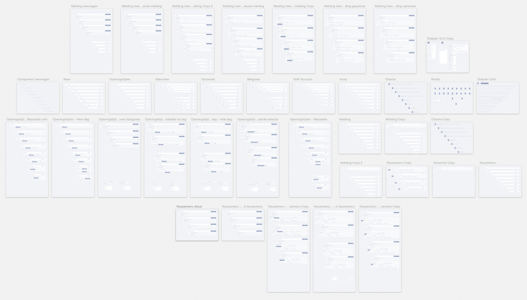
In the last couple of months, I’ve focussed on improving the dialplan interface. The dialplan is one of the most important features of VoIPGRID. It allows users to manage their phone numbers and set up what happens when there is an incoming phone call. I’d like to share some insights we gained during the process.
While I was looking at the dialplan, I identified a few user interface problems. The interface was very cluttered. Information was stacked on top of each other and there was a lack of hierarchy, which made it hard for users to quickly determine what information was most important or relevant to them.
My colleague Tim (who is very skilled in conducting user research) already collected valuable feedback from users. The issues clients encounter were clearly related to the way the interface was designed.
People told us the interface was complex and didn’t provide them with a clear overview of the actions that will be executed under certain circumstances. We noticed important information, that users needed in order to determine what was going to happen when someone would call their phone-number, was missing in the interface.
With the feedback in mind, I went to work and designed a prototype that contained solutions for various issues.
Visual hierarchy is one of the most important principles behind effective web design. It’s about organizing information in a way that is usable, accessible and logical. People innately scan for information that is relevant to them. Having a clear visual hierarchy helps people to easily find what they are looking for.
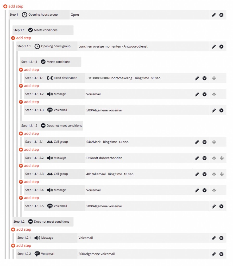
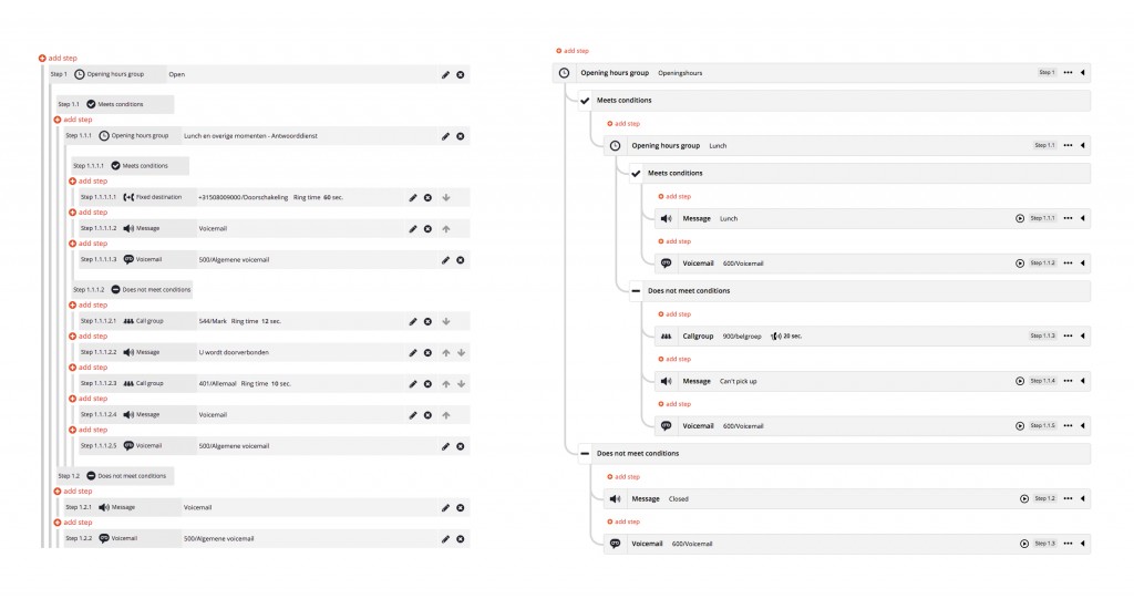
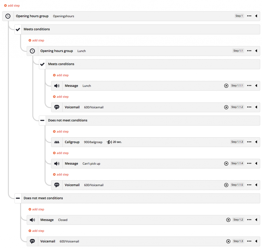
Looking at the hierarchy of the information within a dialplan step, I concluded we had to relocate the step identification number. Numbers like “1.1.1.2.3.1” are not clear visual elements that enable the user to quickly determine the meaning of steps. The unique identification number has no intrinsic value. They are only valuable if someone is going to refer to a specific step.
I decided to place the icons up front instead. Icons have a large visual impact and are much easier to differentiate from each other. The video above shows the transition undergone by the interface.
Step identification numbers could also become very long, which made them incomprehensible to read. The longest step identification number contained 21 numbers. It looked like this: “1.1.1.1.2.1.1.2.1.1.2.1.1.1.1.1.3.2.1.1.1”. Fortunately, this is not a common case in the VoIPGRID dialplan. This specific case was in one of the most extensive and complex dialplans created by one of our customers. I figured this could be improved and would also have impact on less extensive dialplans.
The step length increasements are due to modules with conditions. Take for example a time group. The time group module can be used to set the telephone routing during office opening and closing hours.
Conditions can be set and the system will check if the conditions are being met. For example, if the conditions of an opening hours module are set between 9:00 and 18:00, the steps listed under the conditions met section will be executed during that time.
In the interface, conditional terms have their own indentation level and receive a unique step identification number of their own. This is not necessarily required. The conditional terms appear as if they are an independent step, but they are always part of the parent element.
We could simplify the interface by making them a more distinctive part of their parent. The length of step identification numbers could be halved, which makes them easier to read. Support for mobile browsers would be improved by keeping the conditional terms on the same indentation level as their parent.
The design of the dialplan contained seven dense vertical lines that functioned as rulers so users could differentiate the indentation levels. The vertical lines were hard to follow and differentiate because they were standing so close to each other. The density of these vertical lines was initially made like this to create more screen estate for the actual step information on mobile views. I’ve chosen to remove the rulers because I didn’t see the need to show rulers at places where they didn’t mark an indentation level. Instead I’ve chosen for a solution that looked more like a flow chart. It provides much more visual tranquility.
All possible locations for a new dialplan step are being shown, but users usually do not wish to add steps to all the possible locations. This causes unnecessary information overload in the interface. I was thinking about switching the logic around. Instead of selecting a location first, users should select what type of module they would like to add to their dialplan and then drag them into position or whatsoever. This would also enable us to tell users up front why certain steps cannot be added to certain locations. We didn’t implement this yet but we’re planning to do so in the future.
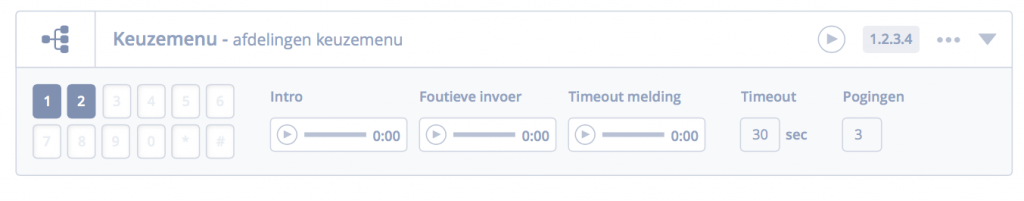
Setting up a dialplan is hard if you don’t know what the context is. For example, if a customer would decide to add an IVR menu to the dialplan it required them to browse to a different page to listen to the attached audio message. The IVR audio message could be: “Press option 1 to talk to our customer support, press option 2 to talk to sales”, etc. Without this context, it’s impossible to determine what next actions should be placed under the conditional options of an IVR menu in the dialplan.
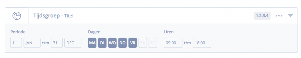
This was also applicable to time groups. There was no way to determine when the conditions of a time group would be met or not. In the prototypes I’ve designed, I added the possibility to toggle additional information for more context. I also did this for messages, voicemails and call groups. We received many compliments about this.
Usually we create mockups in wireframe programs like Axure or InVision app, but the dialplan has so many variable options that it is very hard to test it with users. If we would have to create a mockup with these tools while giving a test user options to discover, it required us to create so many wireframes that it would take us ages to complete the wireframes and verify the conceived solutions.
Instead, we chose for a paper prototype session with users. We printed all the various components that could be combined together. Although I spend a day printing and cutting 43 A3 sized paper sheets, paper prototyping is a much easier and faster way to prototype such an interface. During our paper prototype sessions with users, we learned that we were in the right direction but still needed to tweak. We iterated and kept improving until we were confident enough to start implementing.
In the last couple of months we implemented improvements in small parts. Some were easy to implement and some were more difficult. My colleague Redmer took responsibility for most of the coding. After the amounts of coding he has put in, he is in my opinion perfectly capable of calling himself the Dialplan Master. He had to hustle around with many technical restrictions, mostly because a big part of the dialplan logics get handled in the backend code.
With the completion of fixing the “save and cancel” button we’ve completed a milestone. Empty steps can no longer be saved. The dialplan of 2016 is much more user-friendly.
We would love to see people being able to create and edit messages, call groups, time groups and more directly in the dialplan, instead of having to go back to the admin page to separately edit these modules. It would enable users to setup a dialplan much faster, so they can become even more productive.
We already have some ideas about how this ‘inline-editing modules’-part of the dialplan could work in the renewed interface. So, hopefully somewhere in the near future this belongs to the many possibilities of the VoIPGRID platform as well.
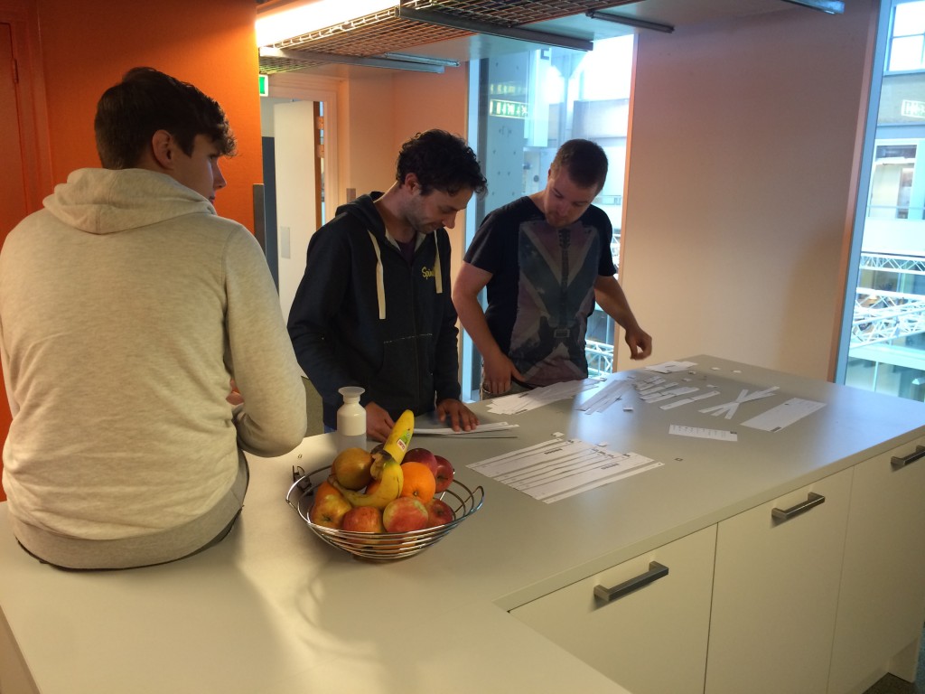
During startup weekend Groningen I participated in a team that wanted to make it easier for travelers to decide what their destination will be, and what they want to see or do during their holidays.
The hypotheses is that people are being overwhelmed by the amount of choices they are offered on the internet now-a-days. While simultaneously the offer primarily exists of hotel images rather then a look and feel of the journey they can experience. Therefor people struggle to feel comfortable/ensured that the holiday they are about to book is going to be awesome and up to their expectations (or beyond).
In comparison to hackathon’s, startup weekend is much more about finding a viable business model. Which is in fact a lot harder, especially if you have to do it in only 54 hours with people you have not met before. Bouke Nielsen, a journalist at the “Dagblad van het Noorden” followed us during the weekend. He witnessed the struggles that we gone through and was able to pin point the “Magical Moment” that occurred during the startup of a company.
Read all about it in this article featured on Noord Blog:
The solution we had in mind and tried to evolve into a business model is a solution in which other travelers can create an itinerary. Research has shown that there are many people using excel sheets to plan there holidays. They spend many hours searching the internet for awesome spots to go to. What if we would provide them with the right tools and allow them to share their itineraries? It would save others much time doing the same research. And what’s more personal then doing the trips others have prepared for themselves?
This is a repost from an article I wrote for Devhouse Spindle https://wearespindle.com/articles/sass-vs-less-anno-2015/
Nowadays a CSS pre-processor is indispensable. When we decided to implement a pre-processor into HelloLily, I immediately proposed to use Sass because I was accustomed to work with Sass and had done my research in the past. One of my colleagues rightly asked whether I made this choice consciously.
I realised that my decision was based on the research I had done in the past, but the developers of Sass and Less have been busy in the meantime. Things change quickly, so despite the fact that I was really satisfied with Sass, I had to update my frame of reference. How does Less(.less) compare to Sass(.scss) anno 2015?
In my search for information about which pre-processor to use, I found many opinionated discussions. Another problem was the high amount of dated information. Arguments that used to be true weren’t true anymore. I asked other well known front-end designers about their current personal preferences. Even among them there is unclarity about how Sass compares to Less. Many of them gave arguments in favour of Sass, but most of the arguments given were no longer valid.
Just to give an example; some argued that Less didn’t have a nice way to do breakpoints. Breakpoints are a great way to create responsive websites. However, since version 1.7.0 Less offers breakpoints in a similar way as Sass does.
@ipad-size: 768px;
.breakpoint(@canvas) {
   @media only screen and
   (min-width: @canvas) {.props}
}
.luuk-hartsema {
   .breakpoint(@ipad-size); .props() {
      content: 'ipad!';
   }
}
$ipad-size: 768px;
.luuk-hartsema {
   @include breakpoint($ipad-size) {
      content: 'ipad!';
   }
}
Based on the information I have today, I have to conclude that Less and Sass can both do great things and it is a matter of personal preference. Both pre-processors can do the same things, the only difference is that the one does it in a slightly different way than the other. I believe you can get used to both ways.
In version 3 of Sass the SCSS syntax was introduced as the new main syntax. This was a huge improvement. I personally prefer to use the SCSS syntax because it’s like conventional CSS with superpowers. This enables people without experience in Sass to understand things easier. Some prefer the cleaner Sass syntax because it doesn’t require you to write brackets or semicolons.
For the future I foresee that most people will decide to use Sass. If only because the highly opinionated internet is in favour of Sass. Mark Otto, one of the developers of Twitter bootstrap recently tweeted that Bootstrap 4 will be written in SCSS. Another pre-processor to keep an eye on is PostCSS. They claim to be the future after Sass & Less.
At this stage I believe it is wise to go with the pre-processor most people use. It allows front-end developers that join our team to get up and running quickly. For this reason we decided to use Sass. Our CSS is being compiled by LibSass. LibSass is a C/C++ port of the Sass engine. It compiles the code incredibly fast.
I’d like to hear the insights of others. Feel free to share yours in the comment section below. If you like to continue reading. I recommend to read the following sources: Sass-Lang LibSass, LessCss, Css Preprocessor Benchmarks.
I’m a huge fan of hackathons! They are very inspiring and fun to participate at. One of my favorite hackathons is The Next Web Hackathon that is hosted during the Next Web Conference in Amsterdam. It’s one of the biggest web conferences in Europe with over 20.000 visitors and more then 500 startups attending.
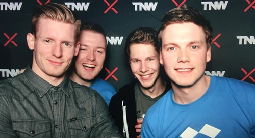
During the hackathon we used the Dropbox API to create a mobile app that allowed users to take and share pictures with people, who are also taking pictures in the same area during a certain timespan. The pictures would instantly show up in a shared dropbox folder.
Our team won kick-ass prices and got featured on the Dropbox blog!
https://blogs.dropbox.com/developers/2015/04/the-next-web-hack-battle-dropbox-api-winners/